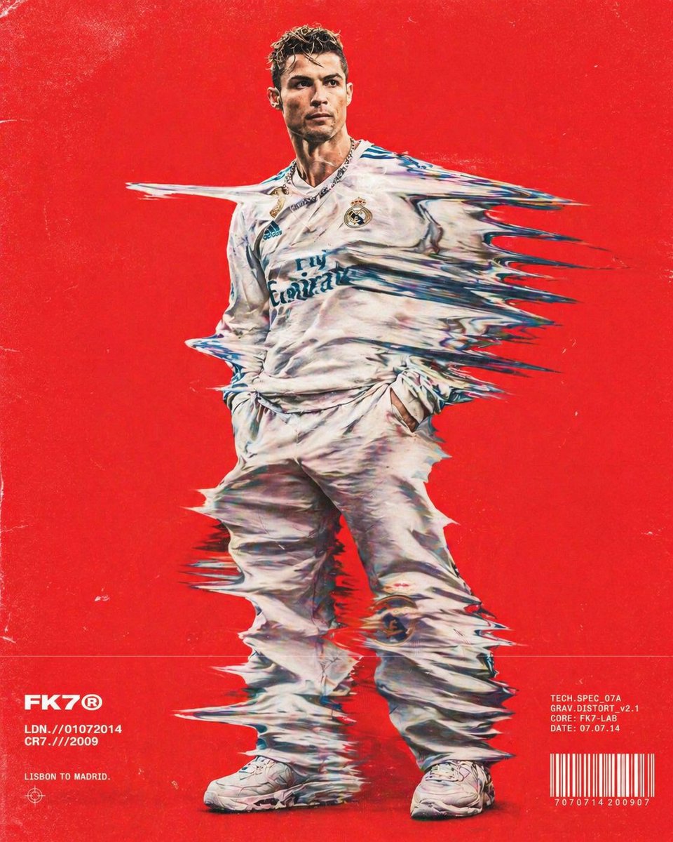

8K Ultra-High-Definition GPT Image Prompt
Poster Design
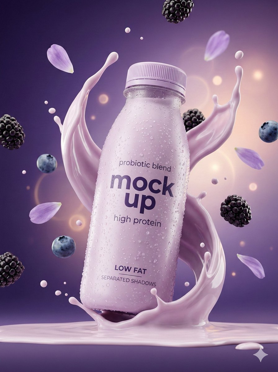 1 / 4
1 / 4关于这款提示词
Use this GPT Image prompt to create poster design imagery. It combines cinematic, pastel, studio lighting direction in a reusable starting point that you can copy and adapt to your subject, brand, or publishing format.
适用场景
- Advertising and campaign posters
- Event and social graphics
- Presentation key art
视觉风格
- Cinematic
- Pastel
- Studio lighting
调整技巧
- Replace every bracketed placeholder with your actual subject or brand details before generating.
- Replace the headline, product, and brand references with your own content.
- Adjust the typography, palette, and visual hierarchy to match the campaign.
- Set the aspect ratio for print, stories, feeds, or display advertising.
How to use and customize the 8K Ultra-High-Definition GPT Image Prompt
This guide explains how to turn the 8K Ultra-High-Definition concept into a controlled, repeatable image-generation workflow. The source prompt is designed for GPT Image and sits within the poster design category, with a visual direction shaped by cinematic, pastel, studio lighting. Rather than treating the prompt as a block of text that must remain unchanged, use it as a creative specification: identify the decisions that define the image, preserve the relationships that matter, and revise one variable at a time. That approach makes it easier to produce useful variations without losing the visual identity that made the original result appealing.
The source contains roughly 316 words and already communicates more than a simple subject request. Its value comes from the way subject, environment, styling, composition, lighting, materials, and output quality work together. A long prompt is not automatically a strong prompt, however. The practical goal is clarity. Every phrase should either define what appears in the frame, explain how the scene is photographed or rendered, establish a mood, or prevent an unwanted result. When a phrase does none of those jobs, it can usually be simplified.
Use the finished example as evidence, not as a restriction. Observe which parts of the image come directly from the written instructions and which parts were interpreted by the model. Keep the strongest visual anchors, then change the subject, brand, setting, palette, camera language, or delivery format to match your brief. This page includes a breakdown, customization framework, production workflow, quality checklist, and practical answers to common questions so the prompt can support real campaign, design, and experimentation work.
Understanding the creative direction
The central idea is 8k ultra-high-definition. That phrase should remain the clearest part of every revision because it tells GPT Image what the image is fundamentally about. Supporting details should reinforce the subject instead of competing with it. If you introduce a new location, prop, texture, or graphic element, check whether it improves the main idea or merely adds visual noise. A useful test is to read only the subject and the first sentence of your revision. If the intended image is no longer obvious, simplify before generating.
The detected style signals are cinematic, pastel, studio lighting. These words influence several decisions at once: contrast, color treatment, surface finish, lighting, production polish, and the amount of realism or stylization. Style terms are most effective when they are supported by physical descriptions. For example, a premium direction becomes more reliable when paired with controlled reflections, refined materials, intentional spacing, and restrained color. A cinematic direction becomes clearer when it includes motivated lighting, depth, atmosphere, and a deliberate camera position.
The current media uses a portrait format. Treat that orientation as part of the composition rather than a technical setting added at the end. Portrait formats reward vertical movement, close product or character emphasis, and room for titles above or below the subject. Landscape formats support environmental context, lateral movement, and wider campaign layouts. Square formats encourage a centered hierarchy and work well across catalogs and social feeds. If you change the aspect ratio, rewrite the framing instructions so important content is not cropped or compressed.
Prompt anatomy and editable variables
Subject and visual hierarchy
Start by identifying the hero subject, the secondary elements, and the background. The hero should receive the most specific language: its identity, shape, pose, scale, material, or defining features. Secondary elements should explain context without stealing attention. Background instructions can be shorter, but they should establish depth, contrast, and atmosphere. When testing a new idea, keep this hierarchy intact and replace the hero subject first. Once the subject is stable, revise supporting elements in a second pass.
Style, material, and finish
Translate abstract style words into visible properties. Describe whether surfaces are matte, glossy, textured, translucent, soft, metallic, printed, hand-drawn, or digitally rendered. Explain whether edges are crisp or diffused and whether the final image should feel polished, tactile, raw, editorial, commercial, or illustrative. Cinematic should be evident in these physical choices. This gives the model concrete evidence for the desired style instead of relying on a stack of fashionable adjectives.
Composition, camera, and space
Control where the viewer looks first. Specify framing, camera height, viewing angle, subject placement, foreground and background separation, and the amount of negative space. For photography-oriented prompts, lens language and depth of field can help, but they should support the composition rather than replace it. For graphic or illustration work, describe the grid, balance, silhouette, and text-safe zones. Make room for any logo, headline, or interface element that will be added later in production.
Lighting, color, and atmosphere
Lighting explains form, directs attention, and establishes mood. Name the key light quality, direction, contrast, and relationship to the background. Then define a limited color strategy that supports the subject. Warm and cool colors can separate planes; complementary colors can create energy; neutral palettes can make materials and typography feel more refined. Avoid listing many unrelated colors. A small, intentional palette is easier for GPT Image to interpret and easier to adapt across a campaign.
Customization playbook
Make changes in layers. Begin with the business or creative requirement, then revise the subject, environment, style, and output instructions in that order. Generating after each meaningful change helps you understand cause and effect. If you change the subject, lighting, color palette, camera, typography, and aspect ratio at the same time, a good or bad result will not tell you which instruction mattered. Save successful versions and label them by the variable you changed.
Customization 1
Replace every bracketed placeholder with your actual subject or brand details before generating. Keep the rest of the prompt stable during the first comparison so the effect of this edit remains visible. Generate a small set of alternatives, select the version with the clearest subject and strongest hierarchy, and only then combine it with another change. Record useful wording in a reusable prompt library; consistent language makes later campaign variations faster and easier to evaluate.
Customization 2
Replace the headline, product, and brand references with your own content. Keep the rest of the prompt stable during the first comparison so the effect of this edit remains visible. Generate a small set of alternatives, select the version with the clearest subject and strongest hierarchy, and only then combine it with another change. Record useful wording in a reusable prompt library; consistent language makes later campaign variations faster and easier to evaluate.
Customization 3
Adjust the typography, palette, and visual hierarchy to match the campaign. Keep the rest of the prompt stable during the first comparison so the effect of this edit remains visible. Generate a small set of alternatives, select the version with the clearest subject and strongest hierarchy, and only then combine it with another change. Record useful wording in a reusable prompt library; consistent language makes later campaign variations faster and easier to evaluate.
Customization 4
Set the aspect ratio for print, stories, feeds, or display advertising. Keep the rest of the prompt stable during the first comparison so the effect of this edit remains visible. Generate a small set of alternatives, select the version with the clearest subject and strongest hierarchy, and only then combine it with another change. Record useful wording in a reusable prompt library; consistent language makes later campaign variations faster and easier to evaluate.
A practical generation workflow
1. Define the delivery requirement
Write down where the image will be used, who should notice it, and what the viewer should understand immediately. advertising and campaign posters may need a different hierarchy from a personal experiment or moodboard. Decide the aspect ratio, safe areas, likely crop, and whether space is needed for copy. These constraints should shape the prompt before generation rather than being repaired after the composition is finished.
2. Replace project-specific details
This prompt contains visible placeholders, so replace every bracketed field before generating. Use concrete nouns and measurable properties when they matter. If identity must be preserved, describe which features cannot change. If the concept is intentionally open, leave secondary details flexible so the model can contribute useful variation instead of forcing every pixel through text.
3. Establish composition before decoration
State the shot type, viewpoint, subject scale, placement, and background relationship early in the prompt. Generate a composition test before investing in fine materials or effects. A strong layout with basic styling is easier to improve than a beautifully rendered image with weak hierarchy. Check silhouettes at thumbnail size, confirm that the focal point is immediate, and verify that important elements remain inside the intended crop.
4. Tune light, color, and surface detail
Once the layout works, refine the qualities that create cinematic, pastel, studio lighting. Adjust one lighting variable at a time: direction, softness, contrast, color temperature, or atmospheric depth. Then refine materials and color relationships. Look for believable contact shadows, consistent reflections, and enough tonal separation between the subject and background. Remove effects that hide the subject or create an artificial, overprocessed finish.
5. Generate controlled variations
Create variations with a purpose. One set might compare backgrounds, another might compare camera distance, and another might test brand palettes. Keep a written baseline so you can return to the strongest version. Avoid selecting only by surface beauty; evaluate whether the image meets the delivery requirement, preserves critical details, and leaves room for downstream design. A repeatable comparison process is more valuable than a large folder of unrelated generations.
6. Finish and validate the selected image
Compare the result against the written brief and the strongest visual anchors in the prompt. Inspect hands, text, logos, repeated objects, reflections, fine edges, and background artifacts at full size. Add final copy and brand typography in a design tool when exact lettering is required.
Quality and consistency checklist
Review the image at three scales. At thumbnail size, the subject and hierarchy should be obvious. At normal viewing size, composition, color, and atmosphere should feel coherent. At full resolution, edges, textures, anatomy, reflections, and repeated structures should remain believable. This three-scale review prevents a polished detail from distracting you from a weak overall design. It also reveals whether the generated image can survive the crops and placements required by a real campaign.
Intent
Confirm that the result still communicates 8k ultra-high-definition and supports advertising and campaign posters, event and social graphics, presentation key art. Remove visual elements that are attractive but unrelated to that goal. The image should have a reason for every major object, color block, and area of empty space.
Coherence
Check that light direction, shadow softness, perspective, material response, and depth agree across the frame. Inconsistent physics often makes an otherwise attractive generation feel synthetic. Correct the largest contradiction first instead of adding more global quality terms.
Brand and production readiness
Verify colors, product geometry, identity features, packaging, and protected brand elements. Confirm that the image has enough resolution and safe space for its intended use. Keep a clean version without text or logos when downstream layout work is expected.
Variation discipline
Keep the approved baseline prompt beside every experiment. Name versions by the variable changed and archive the generation settings with the selected image. This makes successful art direction reproducible and prevents a later revision from drifting away from the original visual strategy.
Frequently asked questions
What is this GPT Image prompt best used for?
It is best suited to advertising and campaign posters, event and social graphics, presentation key art. The underlying structure can also support adjacent uses when the subject, framing, and delivery format are rewritten together. Start from the intended channel and viewer response, then retain the cinematic, pastel, studio lighting qualities that are central to the concept.
Should I copy the prompt exactly?
Copying the source is useful for establishing a baseline, but a production result should reflect your own subject, brand, audience, and output requirements. Preserve the structural relationships that make the example work, then replace project-specific details. Change one group of variables at a time so you can compare results and keep successful wording.
How can I make the result look less generic?
Replace broad adjectives with observable decisions. Specify materials, lighting direction, camera position, color relationships, environment, and signs of real use or physical construction. Add details that belong to the subject instead of adding unrelated style labels. Generic outputs often come from generic nouns, conflicting references, or a prompt that describes polish without describing the scene.
What should I change when the composition is wrong?
Reduce styling language temporarily and rewrite the shot type, viewpoint, subject scale, placement, negative space, and relationship to the background. Generate a simple layout test. Once the hierarchy works, restore lighting, material, and finish instructions. Composition problems are rarely solved by adding resolution or quality keywords.
Can I use the generated image commercially?
Review the model provider terms, the source prompt license shown on this page, and the rights attached to any uploaded reference, logo, person, product, or artwork. A prompt license does not automatically clear third-party trademarks, likenesses, copyrighted characters, or reference images. Keep records of source materials and complete a separate rights review for commercial campaigns.
相关提示词推荐
继续浏览使用相同模型和创意分类的其他提示词。
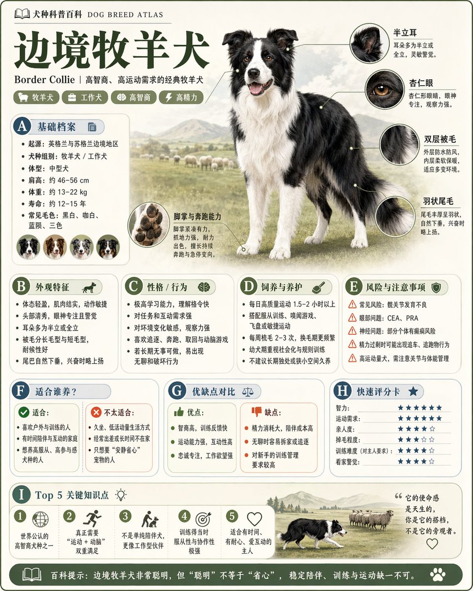
Poster Design GPT Image 提示词
查看提示词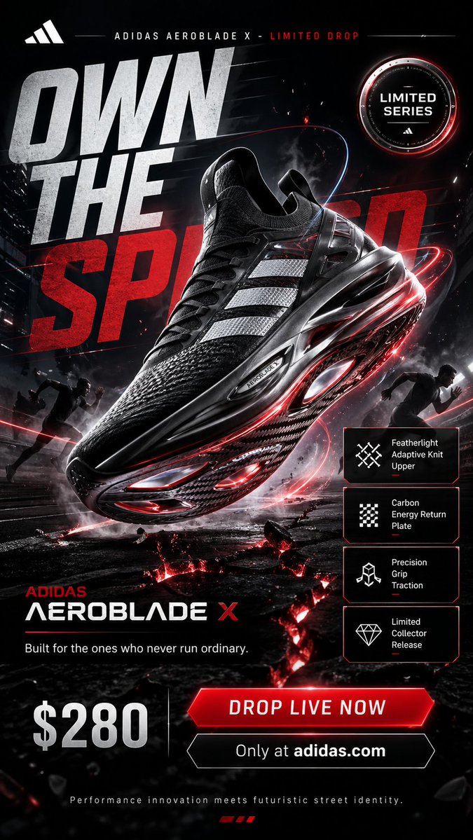
jaw-dropping premium GPT Image 提示词
查看提示词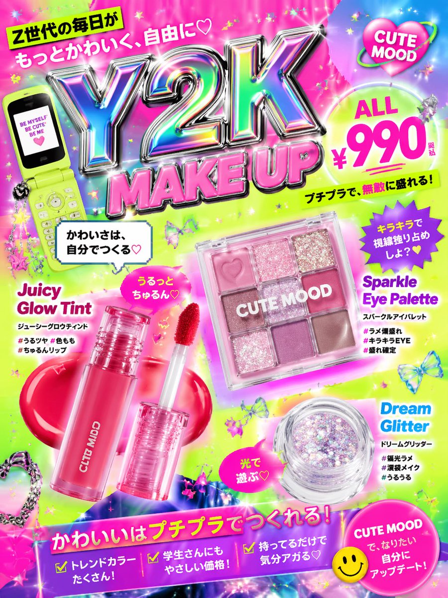
Cute Y2K style affordable GPT Image 提示词
查看提示词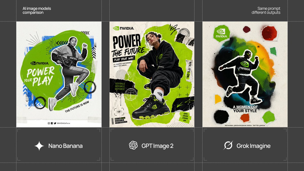
[BRAND NAME = CHANGE TO YOUR GPT Image 提示词
查看提示词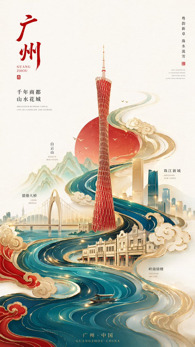
新中式极简风格高端城市海报,9:16竖版构图,以广州为核 GPT Image 提示词
查看提示词